Back to My Work

Pebbles Photography — Portfolio & E-Commerce Website

A complete redesign of a photography portfolio and e-commerce store, improving navigation, image presentation and the buying experience across desktop and mobile.

Role UX/UI Designer & Front-end Developer
Platform Custom Portfolio + E-commerce
Client Pebbles Photography

Project Overview

Pebbles Photography is a premium wildlife and landscape photography brand based in North Norfolk, showcasing dramatic coastal landscapes, wildlife, and exhibition-quality prints. The project involved a full redesign of their existing website, transforming it from an outdated, difficult-to-navigate platform into a modern, photography-led e-commerce experience.

The redesign focused on creating a premium, image-first layout that showcased the photography with maximum impact while streamlining the browsing and purchasing journey. I handled both the complete UX/UI design and all custom front-end development work, building responsive templates, gallery systems, category hierarchies, and the full e-commerce checkout flow using HTML, CSS, and JavaScript.

The new site introduced a modern responsive system optimized for mobile and tablet viewing, faster image loading, clearer navigation structures, and a simplified checkout process—all designed to reduce friction and increase online sales while maintaining the premium, artistic brand positioning.
Context & Background

Pebbles Photography had built a strong reputation for dramatic Norfolk landscapes, intimate wildlife photography, and regularly exhibited work. However, the existing website was no longer serving the business effectively. The visual design felt dated, lacking the premium quality that the photography itself deserved. More critically, the site wasn't mobile-friendly—a significant issue as more visitors were browsing on phones and tablets.

Navigation was confusing, with images lacking clear hierarchy or logical grouping. Potential buyers struggled to browse collections effectively, and the purchasing process was slow and unintuitive, requiring too many steps and offering unclear information about framing options and delivery. The category structure was poorly organized, making it difficult for visitors to discover related work or explore the full portfolio.

SEO performance was weak, limiting organic discovery, and the overall user experience failed to reflect the quality and professionalism of the photography being showcased. The business needed a complete digital transformation to convert more browsers into buyers and to position the brand appropriately in an increasingly competitive online photography market.

Business Goals & Objectives

User Personas / Audience

The website needed to serve multiple distinct audience segments, each with different needs and goals:

My Role & Responsibilities

For this project, I handled both the complete UX/UI design and all custom front-end development work. This dual role allowed me to ensure design fidelity throughout implementation and optimize the technical execution based on design intent.

Design Responsibilities:


Development Responsibilities:

Key Challenges

Process

1. Site Audit

Conducted comprehensive analysis of the existing website, identifying usability issues, technical constraints, and opportunities for improvement. Documented navigation pain points, slow-loading elements, and areas where potential customers were dropping off.

2. UX Patterns & Competitor Analysis

Researched successful photography portfolio and e-commerce sites to identify effective patterns for image presentation, navigation, and checkout flows. Analyzed how premium brands balanced artistic presentation with commercial functionality.

3. Wireframing

Created low-fidelity wireframes for key page templates—homepage, category pages, product detail pages, and checkout flow. Focused on information hierarchy, navigation patterns, and content prioritization before adding visual design.

4. Navigation Planning

Developed comprehensive sitemap organizing hundreds of photographs into logical categories and subcategories. Designed navigation system allowing easy browsing while maintaining clear paths to purchase.

5. UI Concept Development

Designed high-fidelity visual concepts establishing the premium black theme, typography system, and component library. Created mockups for all major page types ensuring consistency across the entire site.

6. Responsive Design

Adapted desktop designs for tablet and mobile viewports, rethinking layouts, navigation patterns, and image presentations for smaller screens and touch interfaces. Ensured the photography remained impactful at all sizes.

7. Front-End Development

Built custom HTML/CSS templates, implementing responsive layouts, gallery systems, and interactive elements. Developed JavaScript functionality for image galleries, shopping basket, and dynamic content loading.

8. E-Commerce Flow Integration

Implemented complete shopping journey from product selection through customization (framing, sizing) to checkout and payment. Created clear, streamlined interfaces reducing steps while maintaining necessary information.

9. User Testing & Feedback

Conducted user testing with existing customers and new visitors, gathering feedback on navigation, image browsing, and purchasing flow. Made iterative refinements based on real-world usage patterns.

Information Architecture / Sitemap

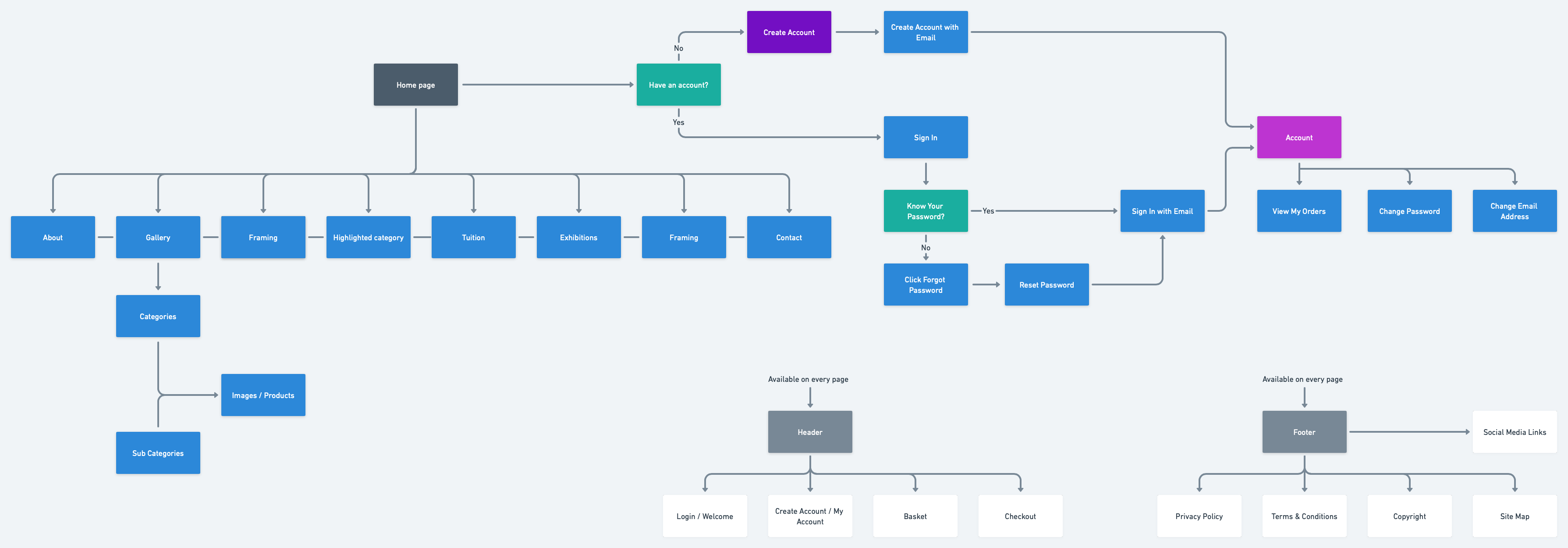
The information architecture was completely restructured to create clear, logical pathways through the content. The new sitemap organized the site into distinct sections:

The sitemap flowchart document visually maps these relationships, showing how users can navigate between sections and how the category hierarchy supports both browsing and purchasing behaviors.

Wireframes & Early Concepts

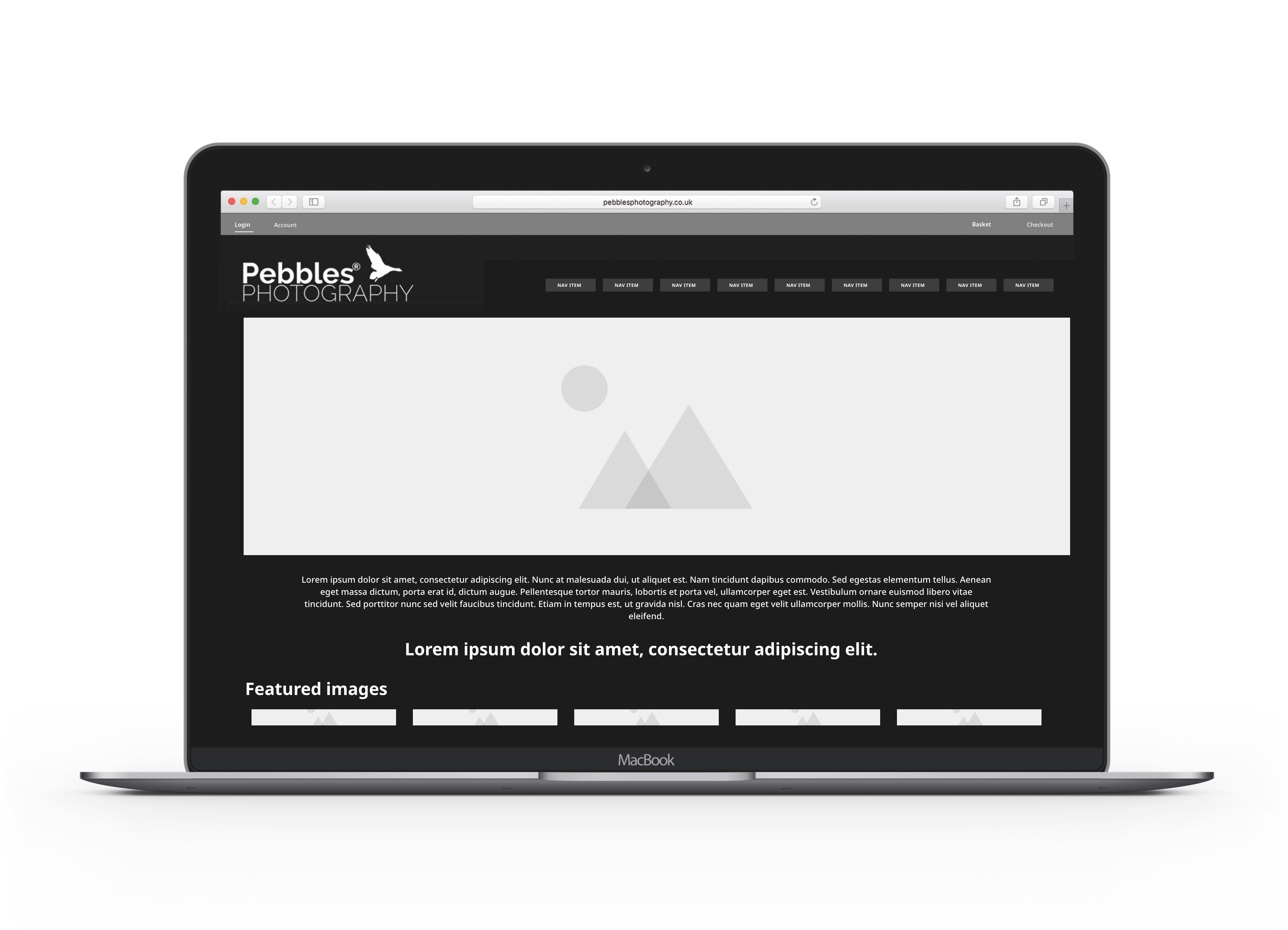
Wireframes established the foundational structure before visual design was applied. The homepage wireframe defined a hero section showcasing featured photography, followed by category tiles providing clear entry points into different collections. The layout prioritized visual content while maintaining clear navigation and calls-to-action.

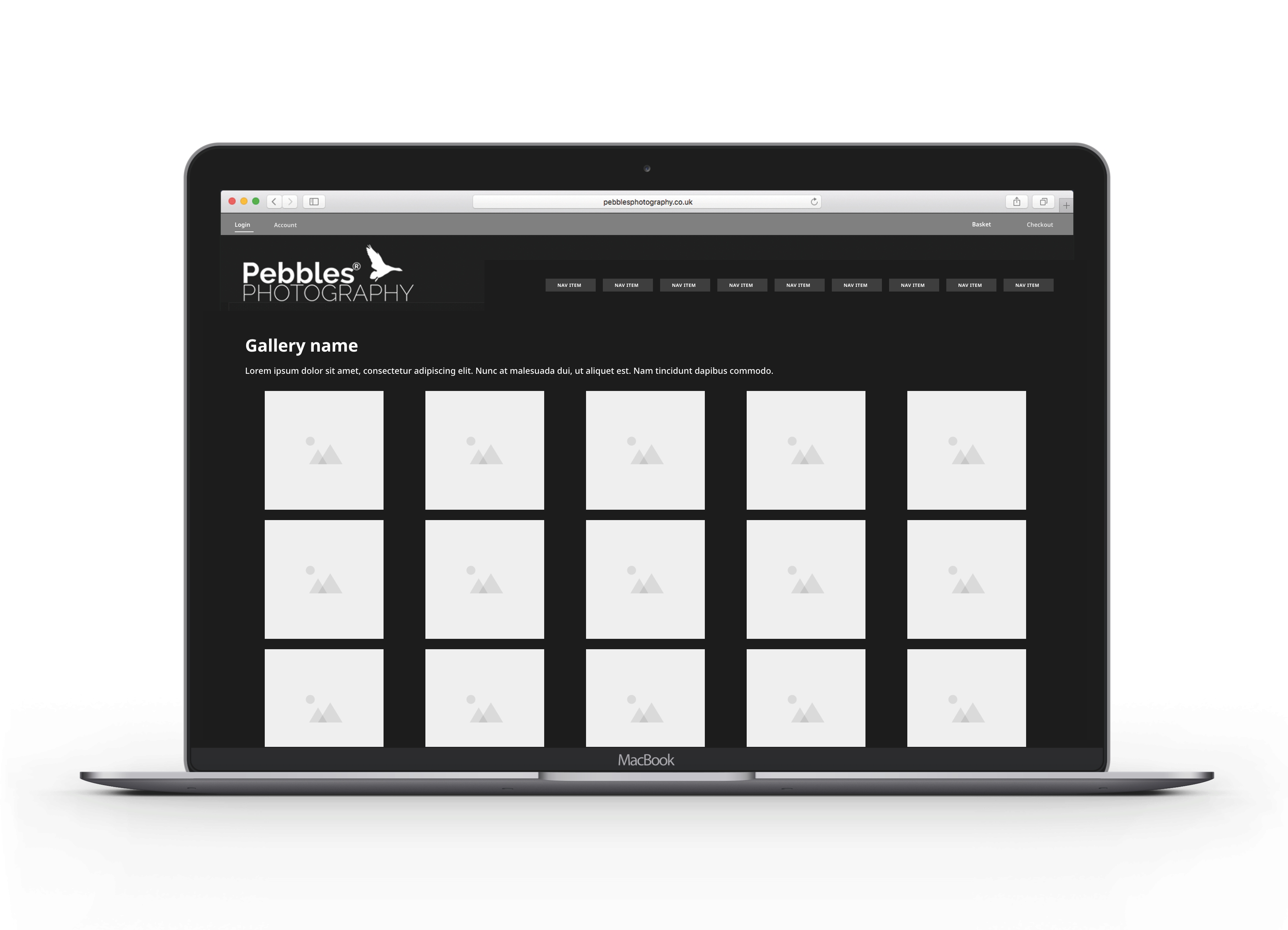
Category page wireframes introduced a grid-based gallery system allowing users to scan multiple images quickly while providing context about each photograph. Filtering and sorting options were positioned prominently without cluttering the visual experience.

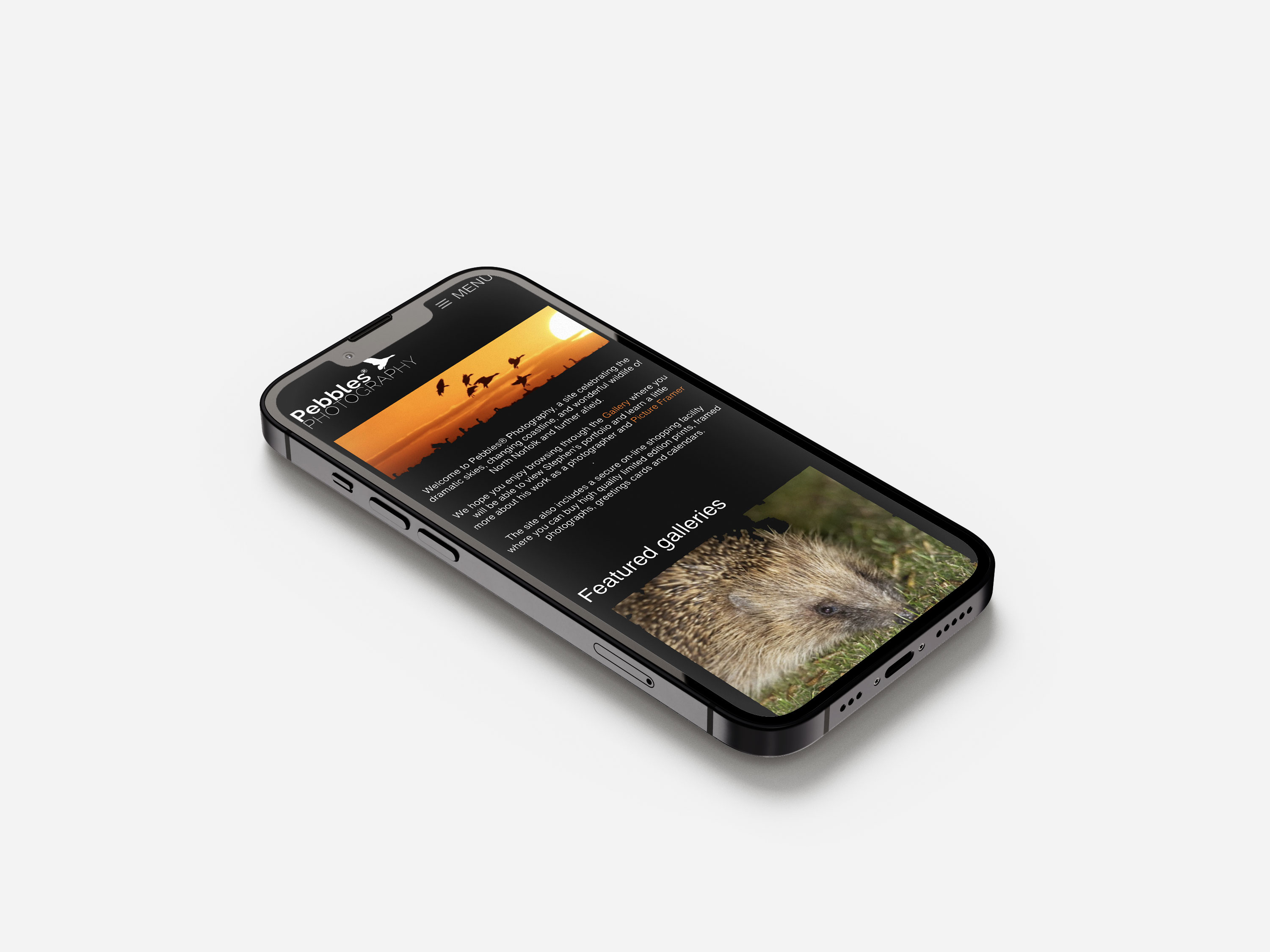
Mobile wireframes rethought the desktop layouts for vertical scrolling and thumb-friendly interactions. The navigation compressed into a mobile menu, while gallery grids adapted to single or two-column layouts depending on screen size. Touch targets were sized appropriately, and image loading was optimized for mobile data constraints.

Final UI Design

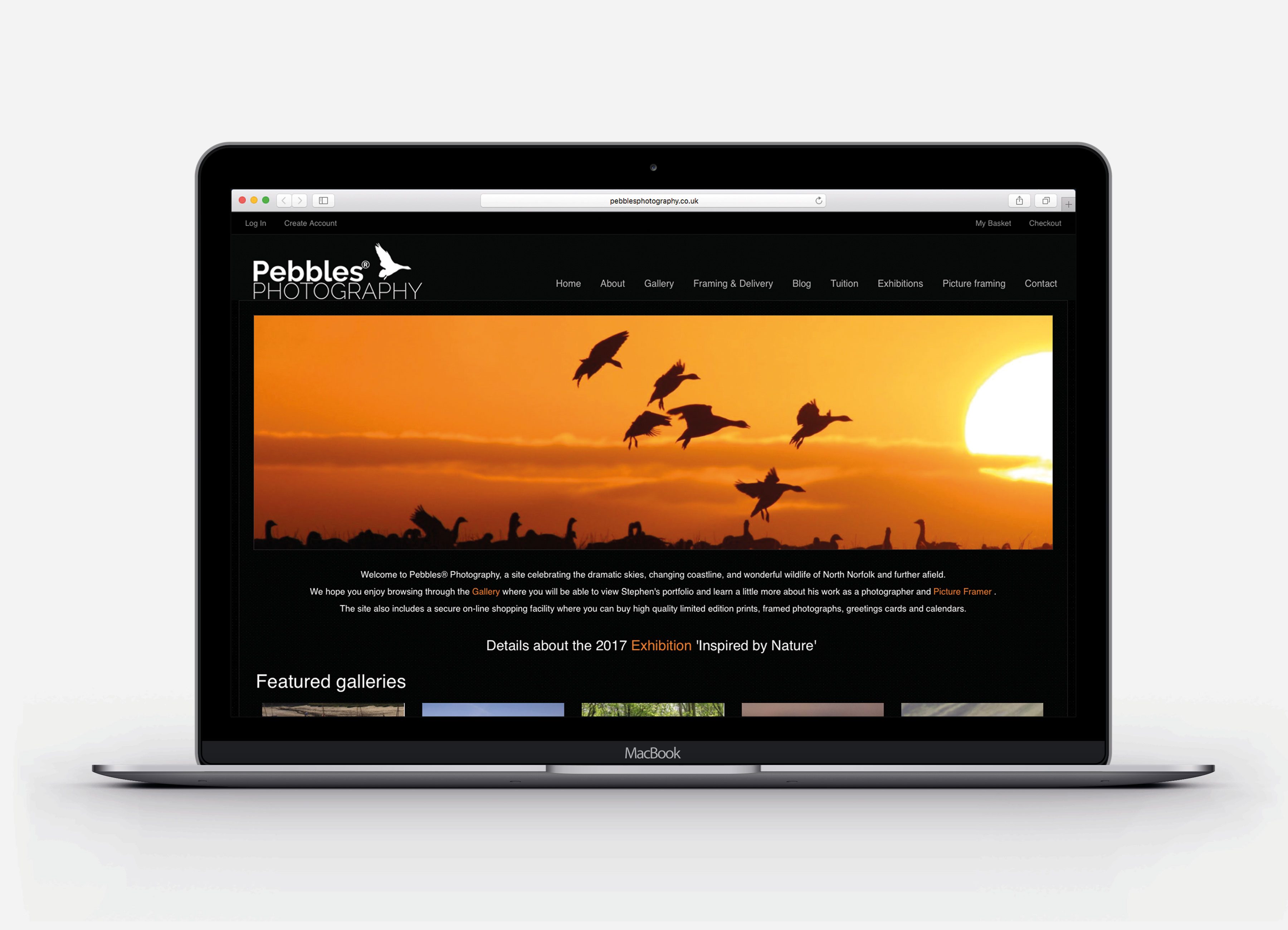
The final visual design established a premium, sophisticated aesthetic centered on a black background that allowed the photography to command attention. This dark theme created a gallery-like atmosphere, mimicking the experience of viewing prints in a curated exhibition space.

The homepage featured cinematic, full-width photography immediately establishing visual impact. Featured galleries were presented as large tiles with overlay text, inviting exploration while maintaining clarity. Typography was clean and restrained, using white and light gray text to maintain readability against dark backgrounds without competing with the imagery.

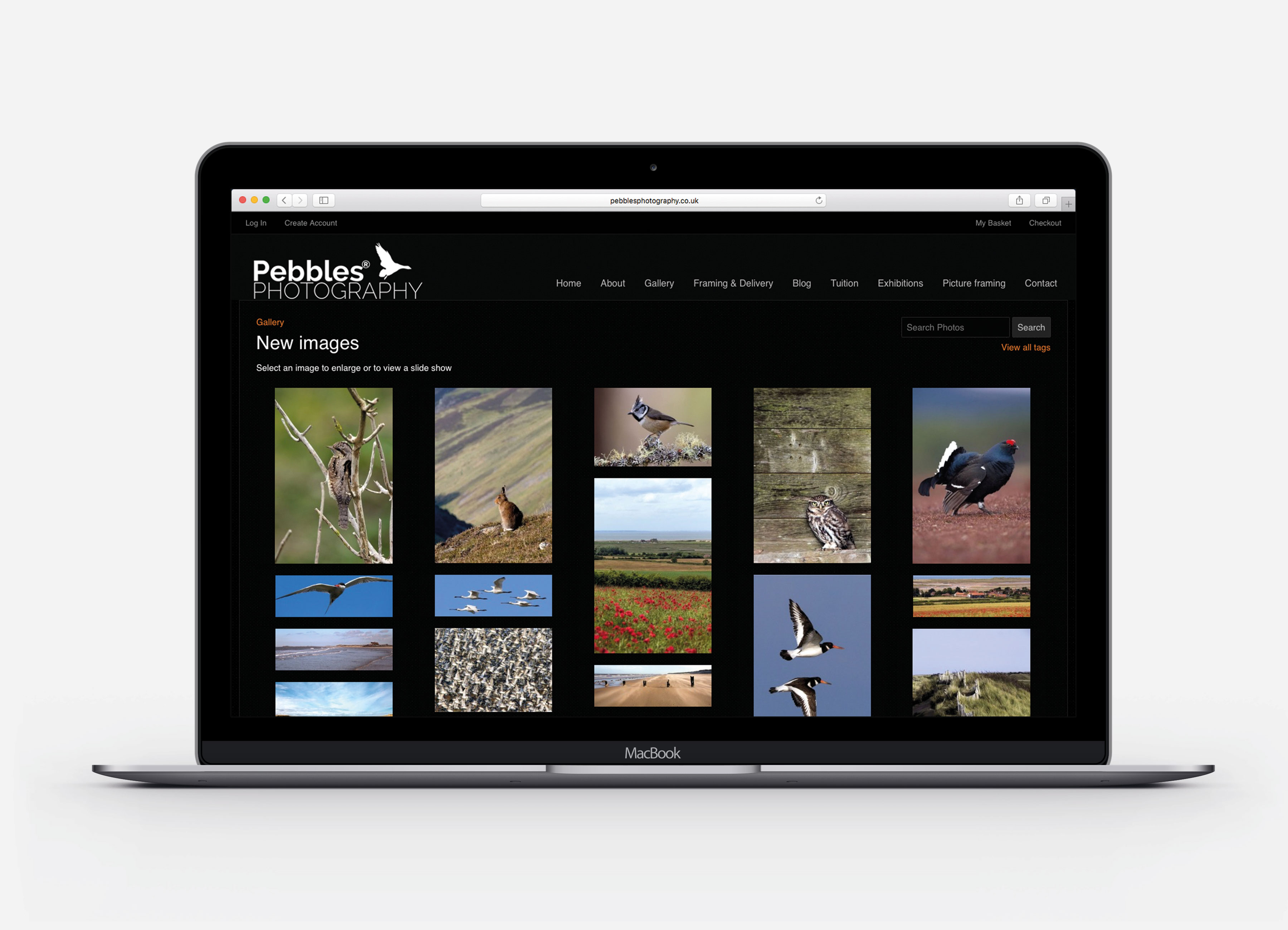
Category pages employed a clean gallery grid system with consistent spacing and proportions. Each image preview was large enough to appreciate detail while allowing multiple photographs to be visible simultaneously, encouraging browsing and discovery. Hover states provided subtle feedback without disrupting the visual flow.

Product detail pages gave individual photographs generous space, with large, zoomable images and clear purchasing options. Supporting information—title, description, available sizes, framing options—was organized logically without overwhelming the core experience of appreciating the photography.

Throughout the design, brand consistency was maintained through repeated use of the black theme, consistent typography (elegant serif headings with clean sans-serif body text), and a limited color palette accenting calls-to-action and interactive elements in subtle earth tones that complemented the photography.

Responsive Layouts

Responsive design was critical given the increasing proportion of mobile traffic to photography websites. The mobile experience was completely rethought rather than simply scaled down, with several key adaptations:

E-Commerce Experience

The e-commerce flow was designed to be as frictionless as possible while providing necessary customization options. Product detail pages clearly displayed available sizes, with visual references helping customers understand dimensions. Framing options were presented with photographs showing how different frame styles complemented the work.

Add-to-basket behavior provided immediate visual feedback—a confirmation message and updated basket count—without disrupting the browsing experience. The basket itself was accessible from any page, showing thumbnails, quantities, and pricing at a glance.

The checkout process was streamlined to three clear steps: delivery information, payment details, and order confirmation. Each step displayed progress indicators and allowed easy back-navigation if customers needed to make changes. Clear calls-to-action guided users through the flow, while security badges and clear delivery information built trust.

Account creation was optional but encouraged through benefits messaging (order tracking, saved favorites, faster future checkout). Login was simple and could be completed via email or social authentication. Order history provided easy reordering and print tracking.

Framing and delivery information was presented clearly throughout the journey, with expandable sections providing detailed specifications without cluttering the primary purchase path. Price transparency was maintained at every step, with no hidden costs or surprise charges at checkout.

Outcomes & Impact

Alongside designing the full UX/UI experience, I also carried out all custom front-end development for the Pebbles Photography website—building the gallery system, category hierarchy, responsive layouts, and complete e-commerce flow. The redesigned site delivered a strong commercial uplift, with sales increasing by more than 50% in the first three months after launch, driven by clearer navigation, improved browsing, and a more engaging image-led shopping journey.

Beyond sales metrics, the redesign achieved several qualitative improvements:

The project successfully transformed an outdated, underperforming website into a modern, effective platform that both showcased the photography appropriately and drove meaningful business results. You can view the live site at pebblesphotography.co.uk.

Gallery / Visual Highlights

Back to My Work