Back to My Work

Intranet Redesign

A complete redesign of Countrywide Legal Indemnities' intranet system, improving usability, information architecture, and employee experience.

Role UX/UI Designer
Type Intranet Redesign & Employee Experience
Client Countrywide Legal Indemnities

Project Overview

The previous intranet system at Countrywide Legal Indemnities was outdated, difficult to navigate, and visually inconsistent. Employees struggled to find documents, tools, forms, and business information efficiently, leading to frustration and lost productivity. The need for a comprehensive redesign was clear.

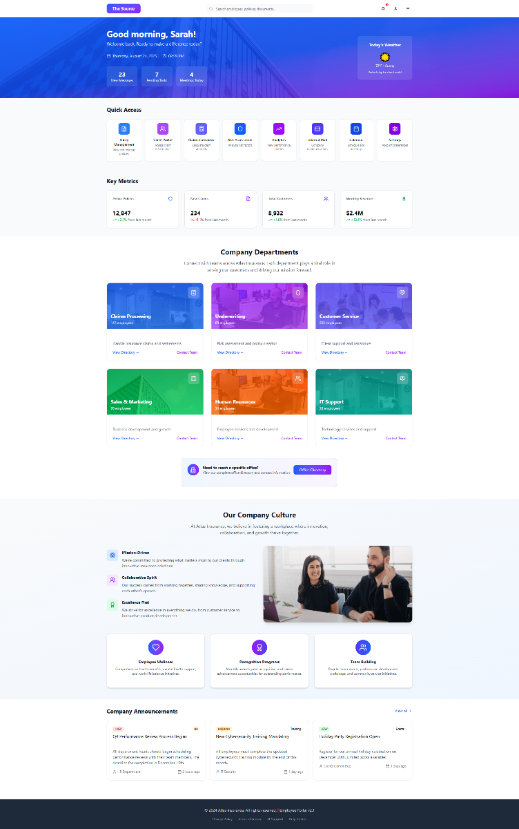
This project aimed to modernize the entire intranet experience, boost employee productivity, and reduce internal friction. The work encompassed UX strategy, UI design, structural mapping, and comprehensive component design—creating a scalable foundation for the company's internal digital ecosystem.
Context & Audience

The intranet served as the daily hub for staff across underwriting, administration, customer support, legal teams, finance, and management. Each user group had different needs, requiring access to different tools, policies, and documents. The challenge was creating a system that felt simple and intuitive while remaining powerful enough to serve these diverse requirements.

The redesign required careful balancing: maintaining simplicity and consistency while ensuring scalability for future content growth. Different departments needed their own spaces, but the overall experience had to feel cohesive and predictable. Success meant creating an intranet that employees would actually want to use—not one they avoided or worked around.

My Role & Responsibilities

Objectives

  • Create a clean, reliable intranet interface aligned with modern UX best practices
  • Improve searchability and reduce time spent finding documents
  • Increase adoption of key tools and resources
  • Create a scalable design system for long-term internal use

Challenges

  • Complex legacy structure with inconsistent content
  • Multiple departments with different needs and priorities
  • Limited analytics on usage patterns
  • Need to balance simplicity with retaining powerful internal capabilities

Process

1. Discovery & Auditing

I began by thoroughly reviewing the existing intranet content and navigation structure, identifying what was working and what wasn't. Through interviews with staff across different departments, I uncovered their pain points and documented common workflows. This discovery phase revealed bottlenecks and high-friction areas—places where the old system was actively hindering productivity rather than supporting it.

2. Information Architecture & Navigation Redesign

Based on the research findings, I created a completely new information architecture that grouped content more logically according to how employees actually worked. I designed a simplified top-level navigation system that made sense to users rather than mirroring the company's org chart. Consistent naming conventions were introduced for pages and tools, eliminating the confusion caused by different departments using different terminology for similar resources.

3. UX Wireframes & User Flows

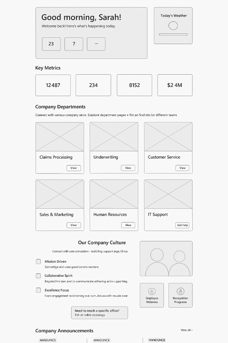
With the structure defined, I designed detailed flows for common internal tasks—finding policies, submitting forms, accessing team resources. Wireframes focused obsessively on clarity, appropriate use of white space, and visual hierarchy. These were tested internally with representative users to ensure the navigation felt intuitive and natural, leading to refinements before moving to visual design.

4. UI Design & Design System

The final phase involved developing a clean, modern interface that aligned with the company brand while feeling fresh and contemporary. I created a library of reusable components—cards, buttons, panels, tables, and tool links—that could be combined flexibly to serve different department needs while maintaining consistency. Responsive behavior was ensured across desktop and tablet devices, recognizing that employees might access the intranet from various locations.

Key UX Improvements

Simplified navigation with clear, predictable structure

Consistent use of typography, spacing, and iconography

Quick access to frequently used tools and documents

Improved search experience

Clean dashboards for key departments

Better visibility of announcements and updates

Accessible colour contrast and form design

Scalable components for future internal growth

Deliverables

Outcomes & Impact

The redesigned intranet significantly reduced employee frustration with the outdated interface, replacing confusion with confidence. Staff reported faster access to commonly used tools and forms, with many commenting that they could now find what they needed without having to ask colleagues or search through email. Internal communication became more consistent, with announcements and updates actually being seen and read.

Positive feedback came from various internal departments, particularly those who had previously struggled most with the old system. Most importantly, the project established a scalable design foundation for future intranet enhancements—a modular system that could grow and evolve with the company's needs without requiring another complete redesign.

Gallery / Visual Highlights

Back to My Work