Back to My Work

CD Promotional Artwork

CD covers, inserts and promotional imagery for a rock band called Cutback, designed for both print production and digital platforms.
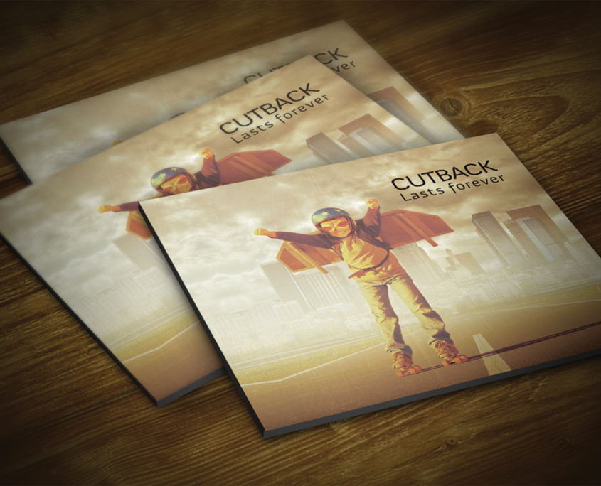
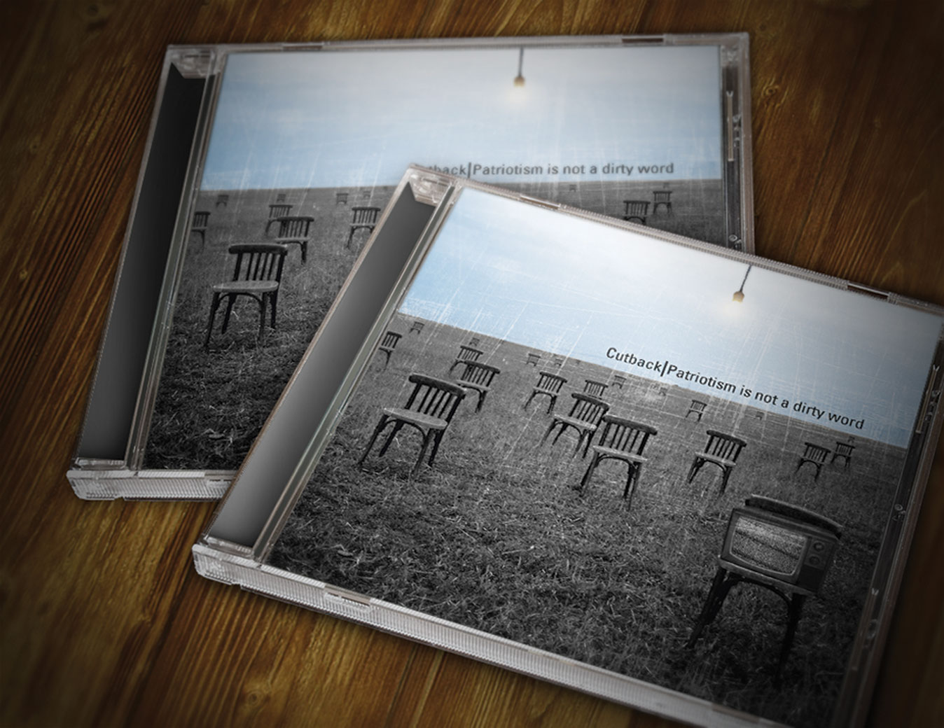
Role Lead Designer
Type Artwork & Print Design
Client Cutback

Project Overview

This is a collection of artwork projects created for different bands and independent artists across various genres. The aim was to create visually striking, genre-appropriate artwork that works seamlessly across CD packaging, posters, and digital assets. Each project focused on developing a coherent visual identity that authentically represents the artist's sound and personality while meeting the technical demands of both print production and digital distribution.

My Role & Responsibilities

Objectives

  • Create artwork that reflects each band's sound, energy and identity
  • Ensure designs work in tiny thumbnail form for streaming platforms and also hold up in physical print
  • Deliver cohesive visual systems that extend across all promotional materials

Challenges

  • Working with varying levels of source imagery quality
  • Adapting concepts to different formats (square covers, landscape banners, vertical posters) while keeping a consistent look
  • Ensuring technical print requirements were met across different printers

Process

1. Discovery & Listening

The process began by immersing myself in the music—listening to tracks, discussing influences with the band, and defining the mood and visual references. This discovery phase helped establish a shared vision and ensured the artwork would authentically represent the artist's sound and message.

2. Visual Exploration

With a clear direction established, I gathered visual references, sketched initial concepts, and experimented with typography and imagery directions. This exploration phase involved testing different aesthetic approaches—from gritty and raw to polished and contemporary—to find the right visual language for each project.

3. Artwork Design & Iteration

Using Photoshop and Illustrator, I created cover concepts exploring different crops, textures, colour treatments, and typographic layouts. Multiple rounds of feedback with the artists helped refine the designs, ensuring they resonated emotionally while maintaining technical quality and brand consistency across all touchpoints.

4. Final Artwork & Production

The final stage involved preparing layers and exports for both print and digital use. I carefully checked bleed, ensured proper CMYK and RGB colour profiles, verified resolution requirements, and provided clearly named, production-ready files to duplication houses and the bands. This attention to technical detail ensured smooth production with no costly reprints.

Deliverables

Results & Impact

The artwork successfully captured each band's unique identity, with artists frequently commenting that the visuals "looked like their sound." The designs were used consistently across merchandise, posters, and social channels, helping bands present a more professional and cohesive visual identity when promoting shows, releasing albums, or pitching to venues and festivals.

All designs reproduced cleanly in both print and digital formats, with no production issues or costly reprints. The versatile artwork systems adapted seamlessly across different aspect ratios and platforms—from Instagram posts to festival banners—maintaining visual impact and brand recognition at every scale.

Gallery / Visual Highlights

Back to My Work